
Parallax Studio Shift the View · No. 03
Shift the View — No. 03 · Capital Bikeshare

The Leaderboard
Is a Lens

The data didn't change. The filters didn't change. One dropdown flipped — and a station with 328 trips took first place from a station with 6,226. Both rankings are true.

One leaderboard, two winners — June 2026, same table, same data
6,226 trips · 1.0 mi avg328 trips · 3.2 mi avg
Trip-count championDistance champion

Here's the setup. May 2026, 506,079 Capital Bikeshare trips. Rank every start station by trip count and Columbus Circle / Union Station wins — the downtown commuter engine, 5,476 departures averaging a single mile. Rank the same table by average distance and the winner is Bethesda Ave & Arlington Rd: 280 trips, nearly three miles each. Same month, same data, same table. Two champions.

The Setup

Two champions, one table.

Neither ranking is wrong. The metric you sort by is a point of view. Volume tells the operations story — where the docks empty fastest, where the rebalancing trucks go. Distance tells the geography story — the edge stations whose riders are covering real ground, not hopping between meetings. A leaderboard that can only tell one of these stories is quietly editing the truth.
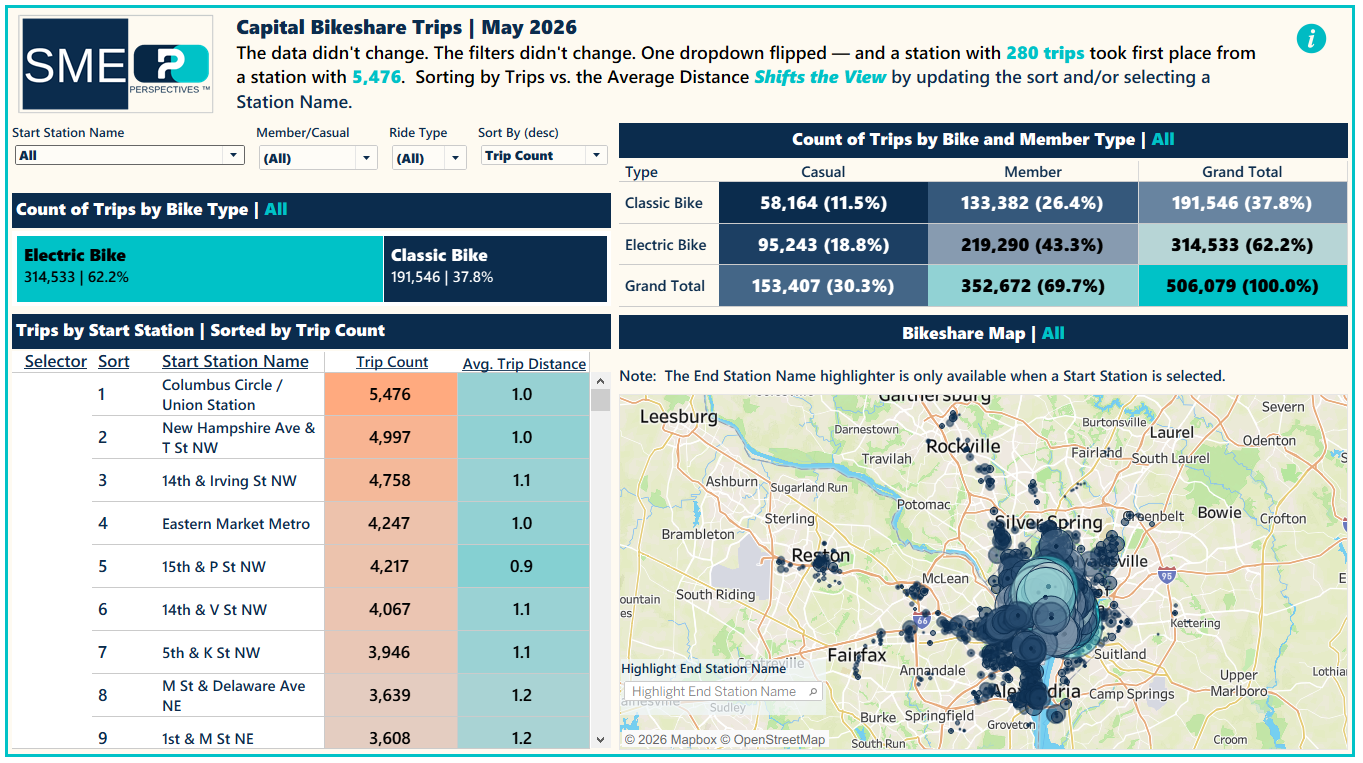
May 2026 SME dashboard: leaderboard sorted by trip count with Columbus Circle first, beside the system density map
May, sorted by trip count. Columbus Circle / Union Station leads at 5,476 — the volume story.
The Turn

The build refuses to choose.

This edition's dashboard carries a sort parameter that re-ranks the table on demand, and a map that re-draws itself around whichever champion you crown. Select a station and the system's full density collapses into that station's corridor web — every route a straight line from one origin, radiating as far as Silver Spring and Alexandria.
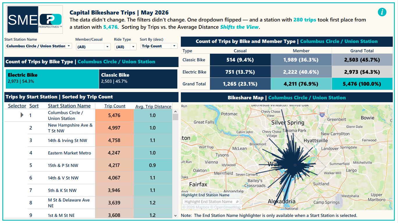
Route map showing every ride from Columbus Circle as a straight line radiating from one origin point across the DC region
Columbus Circle, selected. One origin, every May ride — drawn as straight-line paths, not street routes.
The Check

June arrived — and was verified before the story.

Then the thesis got its real test, but not on trust. Before a single June dashboard was built, the new file was run against the saved May baseline through the Perspectives™ Delivery Layer: same schema, same quality score, 10.7% more trips, classified automatically as a clean successive month — seasonal lift, not pipeline drift. The record:

Perspectives™ Delivery Layer  ·  Drift Record 2026-07-11
Successive Periods  ·  May 2026 → June 2026
Trip Records 592,555 → 655,744  +10.7%
Readiness Score 96 → 96  ±0
Schema Changes None — 13 columns held
Quality Anomalies None detected
Verdict: the June file is a clean successor to May — the volume lift is seasonal demand, not pipeline drift. Every number in this edition was published on data that passed this check first.
Computed classification · period-over-period · public Capital Bikeshare system data
The check is part of the delivery layer, so the story can't outrun its data.
The Proof

Both champions held.

On certified-new data, both rankings defended their titles. Columbus Circle: 6,226 trips, still a one-mile station. Bethesda Ave & Arlington Rd: 328 trips, now averaging 3.2 miles. The rankings weren't an artifact of one month's noise. They're two durable truths about the same system, and which one you see depends entirely on which lens you pick up.
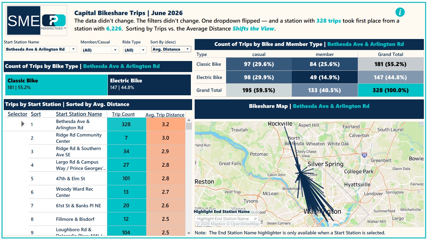
June 2026 SME dashboard sorted by average distance with Bethesda Ave and Arlington Rd selected: 328 trips at 3.2 miles, corridor map on the right
June, one dropdown later. Bethesda Ave & Arlington Rd leads at 3.2 miles — the geography story.
The Rhythm

The heartbeat got louder.

The operations view says it plainest. Allocate each station's monthly volume to the hour that station beats hardest, and the system shows a heartbeat: 153,648 May trips flowed through stations peaking at 5 PM. In June the same pulse grew to 192,829. The rhythm didn't move — it got louder.
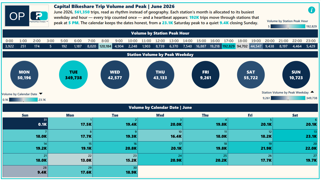
June 2026 Operations dashboard: volume by station peak hour with 5 PM dominant, peak weekday bubbles, and the June calendar
June through the Operations lens — peak-slot allocation above, the honest calendar below.
What to Know

Neither ranking is wrong. The metric you sort by is a point of view — and the leaderboard is a lens.

One Dataset · Four Lenses

The same finding, told four ways.

An analyst, an expert, an executive, and an operator each need a different view of the same truth. Perspectives™ tailors each one from a single governed source — so the story stays consistent while the delivery fits the reader.

DD lens badge

DD · Analyst

Interrogate the rides. Ride-level routes, highlight any single trip, drill from a half-million records.

SME lens badge

SME · Expert

Explain the flip. The sort parameter, the two-champion leaderboard, and the corridor map that redraws per station.

EXC lens badge

EXC · Executive

Decide in one read. The verdict rides the headline; the proof sits one glance beneath it.

OP lens badge

OP · Operations

Run the system. The peak-hour heartbeat, weekday allocation, and the calendar that keeps the dates honest.

Explore

Both months, live.

The Expert and Operations lenses are working dashboards built from one governed source — May and June, side by side. Flip the sort yourself, or open the full workbook on Tableau Public.

If the dashboards don't load, open them directly on Tableau Public →